Lew's AAVSO Format Plotting Workbook
VERSION 2.01Please notify Lew
Thanks!
Why Did Lew Write This Workbook?
Why Did Lew Write This Workbook?
Lew produced the Workbook at Josch Hambsch's request for a way to examine his plethora of observations. Josch has a telescope with on-site management by SPACE at San Pedro de Atacama, Chile. The telescope runs automatically taking CCD images of stars while Josch is at home in Belgium - or traveling on business. As a result, Josch has accumulated millions of observations.
Josch uses LesvePhotometry to automatically process his data. Lesve, the town in Belgium where Pierre de Ponthiere (the author of LesvePhotometry) lives, is pronounced "Lev". You can also use AIP4WIN Version 2.2.0, MaxIm DL (version 5.03), MPO Canopus - By Brian Warner, AstroMB: Computer Aided Astronomy, VPHOT - for images taken with a cooperating network, Mirametrics, or any other software that gives you output in AAVSO Extended Format. That data format is the key to Lew's analysis in the AAVSO format Plotter Workbook.
Imagine the questions you might wonder about in even one night of observations! What does a particular variable star's light curve look like? Were there any cirrus clouds or smoke in the atmosphere during the observing run? Did the cirrus clouds materially affect the data quality? Is the Comparison star or checK star variable? What is the range in air mass? What are the extinction coefficients? (absorption due to atmospheric absorption) Do the (statistical) errors of the variable star measurements depend on the time, the degree of absorption and scattering of the comparison star, or is it due to the dimming of the variable, or due to more and more atmosphere as it got lower (at high air mass)? Does the color of the star affect its extinction (of course it does!)? How much?
Wonder no more. Here is a Workbook that plots out every piece of your data on the star in your run that night. You can plot more nights of data at one time, but SOME plots will be invalid. The LIGHT CURVE will be fine, as will most of the others showing brightness variations. The Air Mass plot is curious because night after night, it will show smooth curves (for as long as you took data). The K-C plots will show all your data. Examine it to see if either star varied. If you see something odd, which star varied? The MERR (magnitude error for the variable star) versus Comp star magnitude, MERR versus Magnitude of the variable star, and MERR versus Air Mass will be from all the nights in the run.
There are 13 steps to get your data into this Workbook that are listed on the Instructions sheet of the Workbook summarized below and explained in more detail (and in plain text) HERE (OPENS IN NEW WINDOW).
You'll OPEN your data file - a text file - in Excel (or equivalent spreadsheet software) using the "Text Import Wizard". The Data MUST be in AAVSO Extended Format!!!
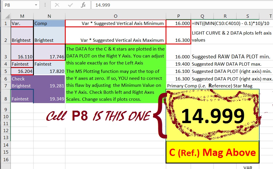
| You'll Copy it. Then, OPEN the AAVSO Data sheet. Select Cell A9 on the AAVSO Data sheet, click Paste Special, Click "Values", Click "OK" You have populated the AAVSO Data sheet with data. Now in Cell P8 type the Comparison star magnitude. | Certain columns intended for plotting may not contain valid data and you WILL GET ERROR MESSAGES. Click "OK" and proceed onward. Ensemble photometry is an example of an instance where there will be unuseable plots (because you have no comparison star measures). There is NO Comp star value, hence you need to enter a reasonable value that closely approximates the value of the Primary Comparison star in Cell P9, or the known K star magnitude there, realizing that your graphed data may or may not be meaningful (depending on which graph you are looking at). The Workbook looks for and counts valid data in the columns used for plotting. If you've got none (or any time you have a non-numeric entry) the Workbook returns a ZERO or some other incorrect number for the number of Rows to plot.
This will destroy the validity of a plot and any numbers derived using that column. The best thing you can do is fill in a bogus number (if the plot or the information derived from it will not be published) or better yet, delete the data row before you enter the data in Lew's AAVSO format Plotting Workbook.
YOU MAY DELETE ANY PLOTS WHICH DO NOT CONTAIN ANY USEFUL DATA by simply clicking Delete Sheet when that sheet is active.
|
IF you have 2 different Comp stars, the plots will be quirky. Not all of them, but the ones for the INSTRUMENTAL MAGNITUDES, COMP AND CHECK stars will be. The DATA PLOT, K-C and C,K vs. Air Mass also depend on consistency. The linear regression lines and equations for C vs. Air Mass, K vs. Air Mass, and K-C vs Air Mass will be invalid if either (or both) stars were changed.
A suggestion: Make another Workbook when you changed the C star.
If you have problems and things don't look right, go to line 37 on the Instructions sheet.
Everything above is on the Instructions sheet, and much more.
You also might ask "But I have data in MORE THAN ONE COLOR! How do I handle that??" Relatively easily, I'd say. BEFORE you Copy and Paste Special into Lew's AAVSO Format Plotting spreadsheet you will need to SORT (A to Z) on the FILTER column BY FOLLOWING THIS PROCEDURE: Highlight Column A on YOUR spreadsheet you made for importing your data into Lew's AAVSO Format Plotting Spreadsheet. INSERT a COLUMN to the left of Column A on that. Copy the FILTER column into that new column (now COLUMN A). Make sure the data in the rest of the rows in the new column is the same as before. Highlight all your data Col. A thru Column P (you have an additional Column after you inserted a new column). Start with Column A. Now SORT A-Z. This carries the data in ALL Rows in the same order as before, left to right, but the data is NOW in groups of each filter. Now, delete the copied filter column (Col. A). Make a copy of each filter's observations to a separate spreadsheet and copy each of them into its own Copy of Lew's AAVSO Extended Format Workbook. Save as "R~RULupi31OCT13.xls" or "V~RULupi31OCT13.xls" or some other name you choose.
IT IS VITAL THAT NO BLANK ROWS EXIST IN THE INPUT DATA
Any blank cells in used cells will throw off the plots. Instead, enter a reasonable value (say, an average of the preceeding and successive rows) or just DELETE that ROW.
|
IF the plot has a lot of blank area above the curve, or you want to have individual plots all with the same scale, you need to adjust the vertical axis scale. To do this, RIGHT CLICK any of the numbers on the Vertical Axis Scale. A window pops up. At the bottom of the list, Click "Format Axis".
Aside: In its "forced obsolescence" policy, Microsoft changes the method of adjusting scale limits from one version of Excel to the next. I've used Excel 97, 2010, 2013 and now 2016. All versions let you make the same adjustments, but each one has a maddeningly different method of getting to the same goal. Yet another window opens. Here, fill in whatever limit for the axis "Minimum" and type in the brightest data you want plotted. Give it a little space so you don't lose any data points. You are going to have to figure out just HOW YOUR VERSION OF EXCEL DOES THIS. Give it a little space so you don't hide any data points. I use 0.1 magnitude less than the brightest data point. If you NOW have extra space at the bottom you want to reduce, the next line is for the Maximum value. In the example below and left, we have adjusted the maximum. | 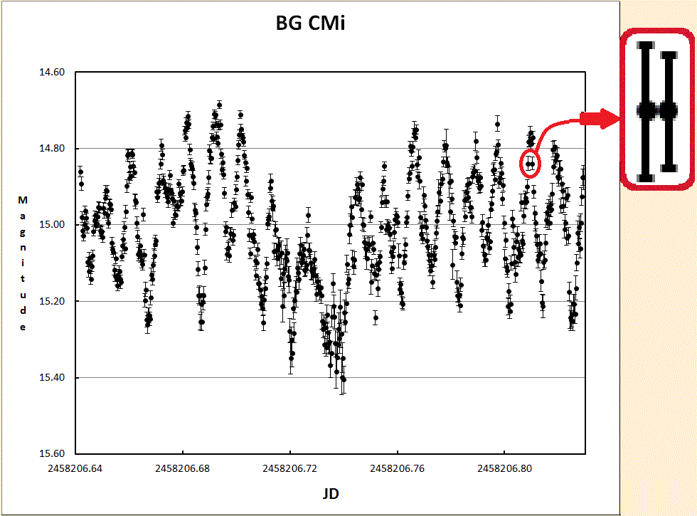 An improvement has been incorporated in the latest version of the spreadsheet: Error bars are now shown. These are the Mag Error data. They can show just how much faith you may have with your results - but beware: these error bars do not include any systematic errors such as poor image flats, etc. |
|
Do the same thing for constraining the right vertical axis or the horizontal axis values. Remember to give extra space for the faintest point, and ADD a fudge factor to the amount you type. You can do similar things for other plots. If you have data from different nights on the same plot, you can adjust the horizontal axis (yet) in a similar manner. However, you won't be able to close the gaps during periods when you don't have data. You could add extra sheets and put a plot for each night by choosing an appropriate X axis range for each night. | This instruction example screen grab was made with an older version of Excel. I could have used a more current version of Excel, but the next time Microsoft "updates" Excel, there will be changes that make this obsolete. 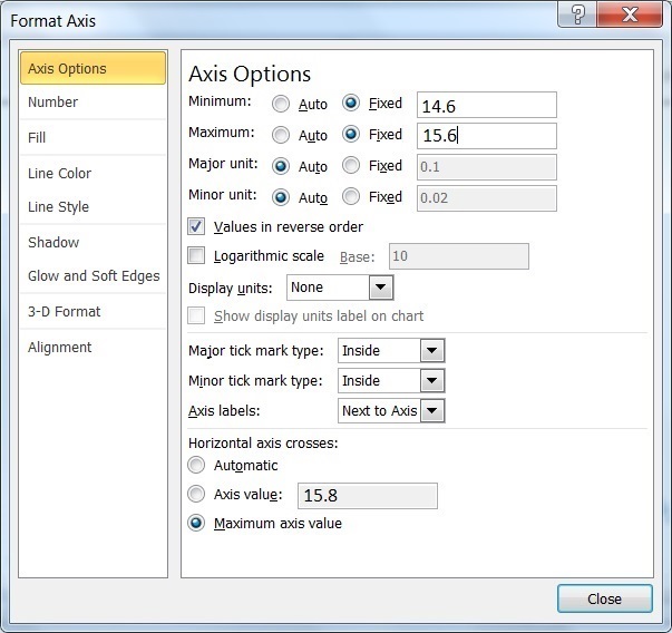 |
|
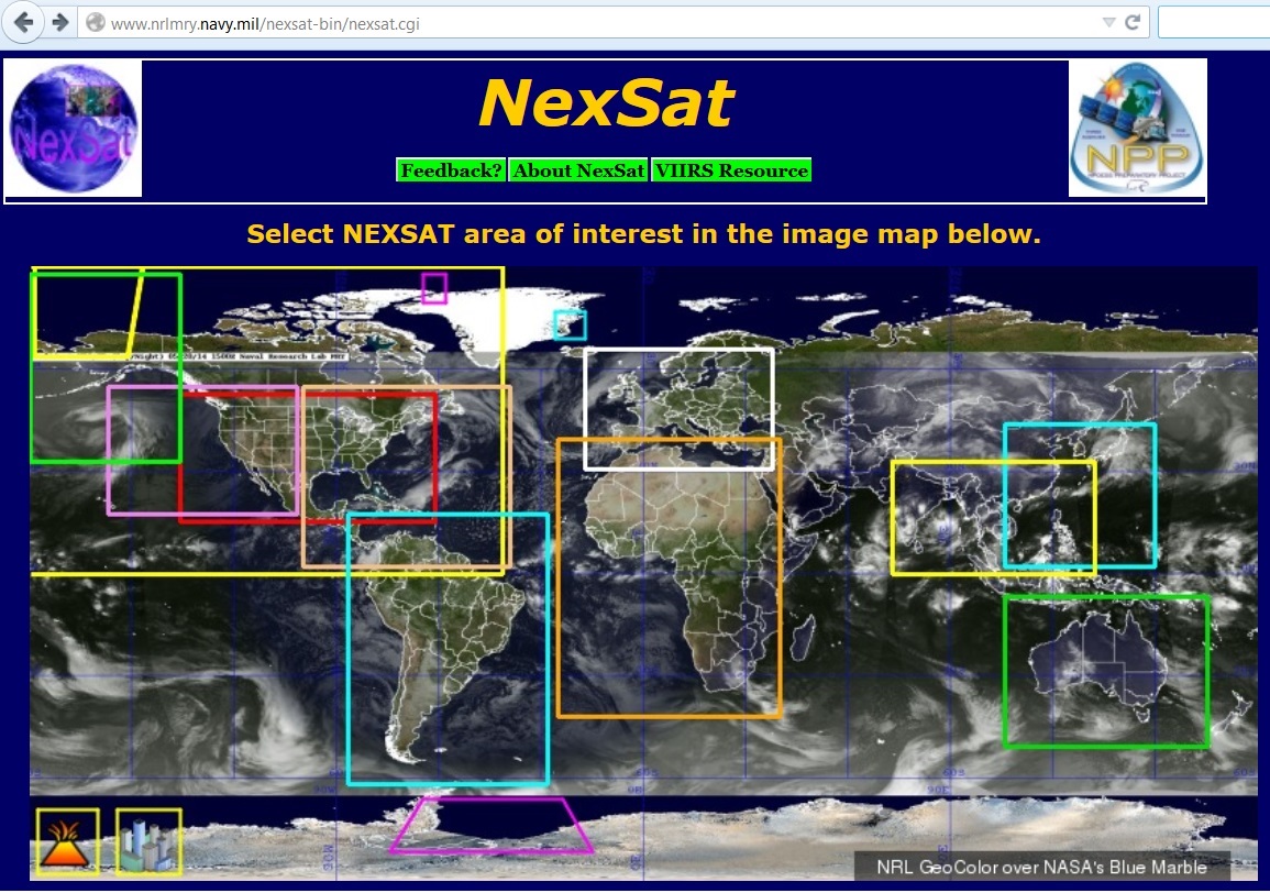
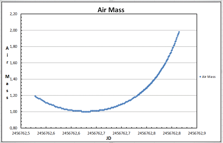
This plots out the calculated (from the input data) Variable Star instrumental magnitudes plus the instrumental Comparison and checK Star measures against time. Here any clouds passing over your observing site will show up by dips in the light curve. This is especially important for remote locations where telescopes operate automatically. Note the left and right vertical scales as shown here are different, as they will often be in AUTOMATIC scale setting mode. The scale for the variable is four times that used for the Comp and checK stars. This is why the dips in instrumental magnitudes (due to cirrus clouds) appear huge for the variable, but small for the other stars. Actually, they are quite similar. Just look at the LIGHT CURVE plot for reassurrance. Note also that the graph came from the (soon to be released) EU version of the workbook. It has commas as decimal points. You can get satellite images from many sources. Cirrus clouds show up best in IR images. You can use one of these areas shown in the map below. THE url IS |  |
| This is a good tool for you to see how clouds in the atmosphere affected your data. Pronounced dips in both curves suggest that there was smoke or clouds crossing your field during the observing run. These will cause the computed linear regression of magnitude vs. Air Mass to be WRONG! The DATA may be acceptable when both the variable and the comparison are equally affected. This is why we plot the K-C values against time (JD) - to check for acceptability. | 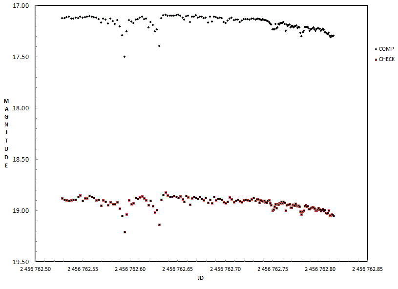 |  |
First, the data is reviewed and the brightest Variable or Check measurement is found. THEN, a tenth of a magnitude is SUBTRACTED to give a bit more space on the top of plot. This is in Cell P1. This is your suggested Vertical Axis Minimum. A similar method is used for the maximum.
Confused by that? Cstd is the ASSUMED value of the Comparison star. First the measured C value is subtracted from the measured K value. THEN, the standard Comparison star value is ADDED back to the MEASURED K-C value, giving a calculated K magnitude. The scatter lets you see how good (or bad) your data is.
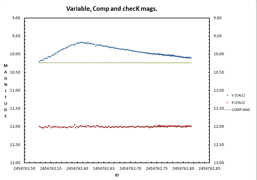 | This workbook finds a value equal to the brightest V or K measurement and subtracts 0.1 magnitude truncating it to the nearest 0.1 magnitude. This means a measured brightest value of 14.99 will have a recommended Vertical Axis minimum value of 14.8. When plotting the K-C+Cstd values, they may be less than the variable value. This is done to allow you to examine your data in advance of releasing it. You can choose to move the plot of the K-C+Cstd up or down, to get it closer to (or away from) the variable plot by adjusting the RIGHT axis scale on the RAW DATA PLOT or the DATA PLOT. Instructions are explained ABOVE. It is useful to have the ranges of the left and right axes equivalent. It is not crucial if they are different, but it is better to have them the same when you are contrasting data sets (especially on the same graph). |
The measured K-C plus the known value of the Comparison star, called Cstd (entered manually BY YOU in Cell P8) produces your measure of K, in the typical K-C manner, and this is plotted. IF the plot of the K values crosses the Variable plot, OR lies too far above or below that plot, you could adjust it up or down.
Do this by adjusting the Axis scale(s) on the left (and/or right) of the plot.
| See the note under the Light Curve Plot listing and adjust the vertical axis to display the plots with the maximum scale useful. | 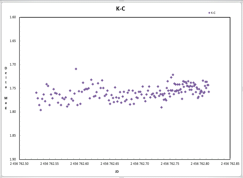 |
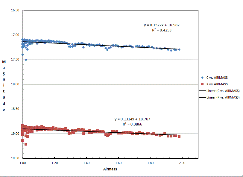
| Do not fear you have bad data if there is a steady slope, usually down, as Air Mass increases. This is due to absorption of light as it passes through more air. This is what Air Mass is a measure of. Use the slope of the curves to get the Extinction Coefficient. DO NOT USE THESE VALUES IF THERE IS SUBSTANTIAL DEPARTURE FROM LINEARITY, i.e. the plots are not smooth, you think the C or K star may be varying, or if clouds were present! The intercept on the magnitude (Y) axis (the first number in the regression equation) gives an instrumental magnitude. How much difference between the instrumental system and actual mags can be calculated by subtracting the instrumental mag from the known magnitude. This should be similar for both stars. Note that the slope of the line for the Comp star (0.15) is greater than the slope of the line for the checK star (0.13). |
 |
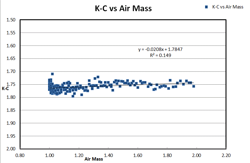 |
As this web page was being prepared, I noticed that the data showed a relative brightening of the checK star relative to the Comp star as time increased. This is because the checK star is redder than the Comp star and therefore will suffer from extinction less than the primary comp (i.e. Reference) star. Look at the K-C vs Air Mass plot. See how it slopes UP? This means: |
| If there were no clouds then the second plot (MERR vs. Comparison star mag.) should be flat, or nearly so. If you had clouds, then as the Comp star fades due to clouds, the error may (probably will) increase. This graph is from a different night where thicker clouds were present. | 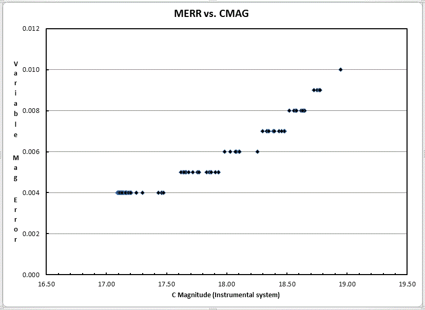
|
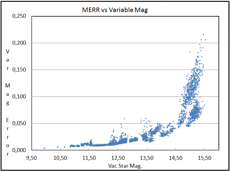 |
If the increase was largely due to the variable becoming faint, then the third plot error will show MERR increases as MAG Increases. Unless the errors are extreme, PLEASE DO NOT DELETE OBSERVATIONS MERELY BECAUSE the STAR IS FAINT and your observations HAVE HIGH ERRORS !! That data is often the most valuable, and certainly should be included. This frequently happens and normally is found in data sets. Shown is data for another star observed for 36 nights by Josch Hambsch. |
| Here is (yet) another way of looking at the source of the Variable Star's Magnitude ERRor estimate. This plot is from many nights, and another star. We examine the MERR against the Instrumental Magnitude of the Variable star. Because the Instrumental magnitude depends on the exposure times, clouds, dust in the air and other obscurations, this plot may look confused. Rather than cherry-pick the nights, I have shown the whole data set so you can get an idea of what numerous factors have on this plot. | 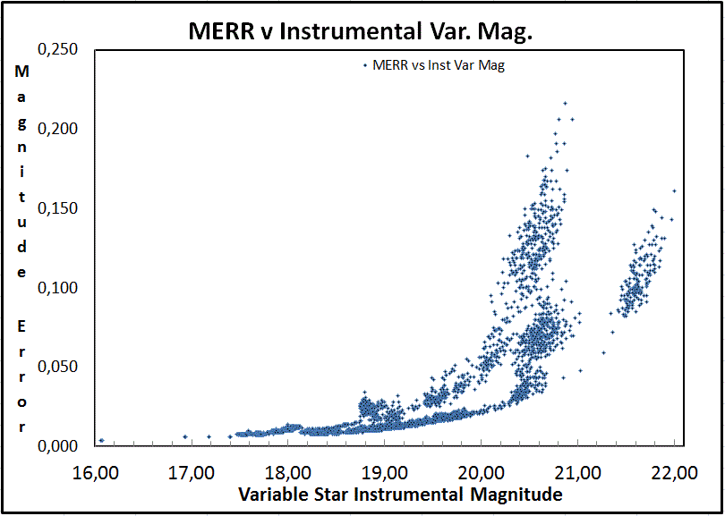
|
| IF MERR increases due to an increase in Air Mass (which will be greatest in U and least in IR), it would also show up in the Comparison and checK star values. The slope of the regression line in C,K vs. Air Mass plot gives you an estimate of the extinction coefficient (usually less than 0.4 mag per unit of Air Mass for V, and much less in good skies). Light in U, B, V, Rc and Ic have (in that order) decreasing values for the extinction coefficients. | 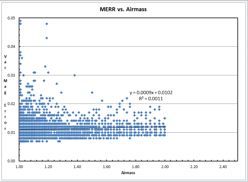
|
What will influence the time between observations?
I'm sure there are many others, but what is plotted here are the results of all those factors. Starting at the SECOND data point, two numbers are shown on the AAVSO DATA Sheet. In Column X is the number of SECONDS since the JD above the Row that is shown. Column Y has the log10 of that. Column Y values are plotted in the Time Interval since Last Observation against JD. | 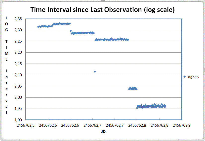
|
This plot shows (on a logarithmic scale) the intervals (in seconds) between the time recorded between the consecutive exposure times. Because the duration of the exposure is not available in the AAVSO extended Data Format, this was chosen as a visual reminder for YOU to examine the changes in exposure times. The plots which display Instrumental magnitudes (charts 2, 3, 7, 10 and 12 ) may show discontinuities due to changes in exposure length. This plot is only for your reference! DO NOT PUBLISH THIS PLOT!!
Choose the size you want.
The files are nearly identical in size, so if you have an older version of Excel, you can downloading the small size and copy it many times (or ask a friend to download the larger version and save it as an [Excel 97] .xls file) otherwise, you'll have to divide up your data into blocks of fewer than 4001 data points, though.
Download 4K-Lew AAVSO Plot Ver. 2.01.xls |
Download 20K-Lew AAVSO Plot Ver. 2.01.xlsx |
How much does it cost? The purchase price of this software is ZERO, NADA, NIL, FREE, GRATIS and NOTHING.
If you use commas( , ) to mark the decimal place and periods ( . ) to mark anything in numerical formats and something like a semicolon ( ; ) for data field separation, you will need to change these for this Workbook. Do this by opening your input data in Notepad (or some other text processing software). First, replace all periods with an "unused" character (like "@"). Next replace the commas with a period. Finally, replace all semicolons with commas. Finally, delete the "unused" character. SAVE this file with a name distinct from your original data file.
All Lew's lewcook.com and (the former) lewcook.net deliverables are provided "as is" without warranty of any kind, express or implied. Lew, CBA Concord, CBA Pahala, lewcook.com and lewcook.net make no warranty as to the adequacy of any software or its documentation to produce a desired result. In no event shall Lew, lewcook.com or lewcook.net or Lew, the author of this software or its documentation, be liable to you for any direct, indirect, special consequential damages, loss of data, or loss of profits that arise from use of this software or its documentation. In no circumstance shall the liability of lewcook.com and lewcook.net exceed the purchase price of this software, which is ZERO, NADA, NIL, FREE, GRATIS and nothing.
By downloading any software or documentation from this website or by receiving it from someone who has downloaded any, you acknowledge and agree to the terms above.
Alternate site:
lewcook.com/lewaavsoformatplot.htm
See Also:
AAVSO
CBA
Lewcook.com